Table of Contents
ToggleColor is the fastest, most affordable way to completely transform a room, and yet many homeowners get stuck staring at paint swatches in fluorescent store lighting, wondering if they’re making a terrible mistake. The truth is, picking a home color scheme doesn’t require a design degree. It requires understanding how colors work together, what moods they create, and which palettes fit your lifestyle and existing elements. This guide walks through proven color schemes for modern homes, room-by-room recommendations, and practical tips for actually implementing them without second-guessing yourself halfway through the project.
Key Takeaways
- Home color schemes directly impact how a room functions and feels; cohesive palettes create flow and make your home feel intentional rather than disconnected.
- Warm grays, soft neutrals, and muted earth tones dominate modern home color schemes because they’re timeless, forgiving, and work with nearly any decor style.
- Test paint samples on 2-foot-square sections under your actual lighting and observe them for at least three days before committing, since north-facing and south-facing rooms display colors completely differently.
- Identify anchor colors like flooring, cabinetry, and fixtures before choosing your color scheme to ensure new colors complement rather than clash with existing elements.
- Bold and moody colors deliver personality but require adequate lighting and work best as accent walls or in specific spaces like bedrooms and bathrooms rather than throughout an entire home.
- Proper surface preparation, quality paint, and correct lighting setup are essential for successful implementation—painter’s tape, primer on dark surfaces, and two coats typically deliver lasting results.
Why Color Schemes Matter for Your Home
A color scheme isn’t just about aesthetics, it affects how a room functions, how you feel in it, and how it connects to the rest of your home. A cohesive palette creates flow between spaces, making your home feel intentional rather than like a collection of disconnected rooms. Poor color choices can make a space feel chaotic, cramped, or unwelcoming, while thoughtful selections can open up a room, enhance natural light, and tie disparate architectural elements together.
Color also influences psychology. Warm tones like terracotta and warm grays create intimacy and comfort, making them ideal for living areas and bedrooms. Cool tones like soft blues and greens promote calm and work well in bathrooms and home offices. Neutral backgrounds (whites, grays, warm beiges) act as anchors, letting you add personality through furniture and decor without overwhelming the eye.
Before choosing colors, assess what’s already fixed in your room: flooring, cabinetry, countertops, tile, and permanently installed fixtures. These anchor colors shape which palettes will harmonize with the space. A monochromatic scheme, using different shades and tints of a single hue, creates visual depth and sophistication without clashing with these fixed elements.
Popular Color Palettes for Modern Homes
Neutral and Warm Tones
Neutral palettes remain the foundation of modern home design because they’re forgiving, timeless, and work with nearly any decor style. Modern neutrals go beyond bland beige: they include warm grays (sometimes called greige), soft taupes, warm whites with undertones of cream or gray, and muted earth tones.
Warm grays bridge the gap between sterile cool grays and yellow-toned beiges, offering the sophistication of a neutral without looking cold or corporate. Popular warm gray paint names like Accessible Beige, Urbane Bronze, and Repose Gray are industry standards because they perform well under different lighting conditions. When pairing neutrals, stick to a maximum of three: a base wall color, a trim/ceiling white, and an accent tone. This prevents rooms from looking bland while maintaining cohesion.
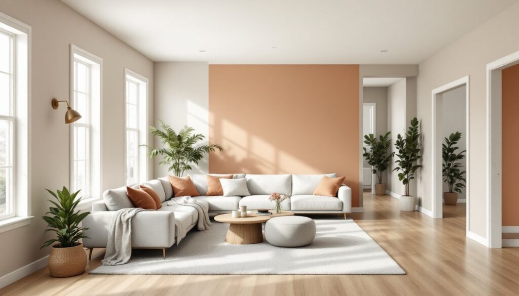
Warm tones like warm ochre, clay, and soft terracotta are having a strong moment in 2026. These earthy hues add personality to neutral spaces and photograph beautifully, which is why they’re everywhere on interior design platforms. They work especially well in entryways, dining rooms, and accent walls where they can anchor the overall aesthetic without overwhelming smaller spaces.
Bold and Moody Colors
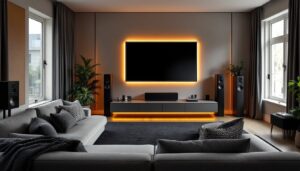
If you want personality, moody colors deliver it. Deep jewel tones, emerald green, sapphire blue, rich burgundy, and dark charcoals create sophistication and drama. These colors work best in spaces with adequate natural light and good artificial lighting, as they absorb light and can feel oppressive in poorly lit rooms.
Moody colors shine in specific applications: accent walls behind headboards or in dining rooms, kitchen islands, built-in shelving, or powder rooms. Painting all four walls a deep color requires confidence and proper lighting design. If you’re uncertain, commit to one accent wall first and live with it for a few weeks. Dark paint also hides imperfections better than lighter colors, making it practical for older walls with character (and character marks).
Complementary color schemes pair opposite hues on the color wheel, think navy blue with warm gold accents, or forest green with burnt orange, creating visual energy. These work well in creative spaces like home offices or hobby rooms where you want to stimulate thinking.
How to Choose the Right Color Scheme for Your Home
Start by gathering inspiration without overthinking it. Collect photos from sources like design-focused websites and Pinterest of rooms that resonate with you, then analyze what you’re drawn to: Is it the wall color, the furniture, the lighting, the textures? This prevents you from choosing a paint color you love in isolation but that doesn’t fit your home.
Next, identify your anchor colors, those fixed elements you can’t change easily. These might be hardwood flooring, kitchen cabinetry, countertop materials, or tile work. Your new color scheme must complement these, not fight against them. If you have warm wood tones, cool-toned paint can clash: if your flooring is gray, warm neutrals might feel disconnected.
Test paint colors before committing. Buy sample quarts and paint 2-foot-square sections on each wall, observing them at different times of day and under various lighting. North-facing rooms get cool blue light: south-facing rooms get warm, golden light. A warm gray that looks perfect at noon might feel too blue at sunset. Live with samples for at least three days before deciding.
Consider the room’s function and traffic flow. A child’s playroom benefits from vibrant colors: a master bedroom needs calming tones. High-traffic spaces should use colors that hide dirt and scuffs (avoid pure white, which shows every mark). If your home is an open floor plan, use subtle color shifts or the same neutral base with different accent colors to define zones without breaking visual continuity.
Room-by-Room Color Recommendations
Entry and Hallways: These spaces set the tone for your home. Warm whites, soft grays, or gentle greiges welcome guests without overwhelming. If your entry lacks natural light, avoid heavy colors that feel cave-like. A brighter neutral or a warm accent color on a single wall (like an interior designer might suggest on House Beautiful) can draw attention to an architectural feature like a staircase.
Living Rooms and Family Rooms: Choose a warm, inviting base color, warm gray, greige, or soft taupe, that works with your furniture and flooring. This is where you can afford to be a bit bolder with an accent wall or a secondary color in a complementary tone. These rooms typically benefit from colors that feel welcoming but sophisticated.
Kitchens: Light, clean colors dominate kitchens because they feel sanitary and open. Warm whites, soft creams, or very light grays pair well with cabinetry and keep the space feeling airy. Darker cabinets pair beautifully with warm gray or sage green walls. Kitchen islands often use deeper, more saturated colors while walls remain neutral.
Bedrooms: Create restful environments with soft, cool-to-warm neutrals, muted blues, soft greens, or gentle warm grays. Avoid overly bright or stimulating colors. Young House Love has documented many bedroom refreshes using nature-inspired palettes that homeowners report feeling calm in.
Bathrooms: Light, clean colors prevent bathrooms from feeling cramped. Soft whites, pale grays, or spa-like greens and blues work well. Bathrooms tolerate color better than some rooms because they’re typically small, well-lit, and temporary retreats. Dark moody colors can work beautifully here if lighting is adequate.
Home Offices: Soft blues, warm grays, and muted greens support focus without inducing fatigue. Avoid overly stimulating colors in spaces where concentration matters. If you spend hours at a desk, you want colors that feel professional and calm, not energizing.
Practical Tips for Implementing Your Color Scheme
Prep surfaces properly. Don’t skip this step, it’s the difference between paint that lasts years and paint that peels after one winter. Fill nail holes and cracks with spackling compound, sand them smooth once dry, and wipe down walls with a tack cloth to remove dust. Existing wall imperfections show through fresh paint, especially with bold colors. If walls are glossy, sand them lightly to help new paint adhere. Use primer on stained, dark, or porous surfaces: it prevents bleed-through and improves coverage, saving you money on additional topcoats.
Invest in quality paint. Budget paint requires more coats to achieve coverage, negating savings. Mid- to premium-grade paints have better pigmentation, coverage, and durability. A gallon typically covers 350–400 square feet with one coat: account for two coats when estimating quantities. Better paint also resists fading, staining, and moisture damage, critical in kitchens and bathrooms.
Get the lighting right. Paint color shifts dramatically under different bulb temperatures. Natural daylight (5,000K) reveals true color, while warm incandescent (2,700K) shifts colors toward yellow, and cool LED (6,500K) shifts toward blue. If a room lacks natural light, warm LED bulbs (2,700–3,000K) prevent paint from looking sickly or flat. Test your color samples under your actual lighting plan before buying gallons.
Start with trim and ceilings. Paint trim and ceilings before main walls, preventing drips onto finished work. Ceiling colors matter, white amplifies light in small spaces, while soft gray creates subtle depth in large ones. Avoid dark ceilings unless you want a cave-like effect in smaller rooms. Trim color should either match walls (monochromatic, modern look) or contrast sharply (traditional, crisp look): half-measure trim colors look unintentional.
Use painter’s tape correctly. Apply tape along trim, ceilings, and adjacent walls, pressing firmly to create a seal. Remove it while paint is slightly tacky (after 15–30 minutes), not bone-dry, to prevent peeling. Painter’s tape left on too long sometimes removes existing paint underneath.
Paint sample colors in your actual home. Interior design websites like Home Bunch showcase stunning color selections, but your lighting, flooring, and furnishings differ. What looks perfect in a professional photo might clash in your space. Live with samples for several days before committing to gallons.
Don’t feel locked in forever. Modern paint is fairly forgiving, two coats of quality paint typically covers dark previous colors. If you pick a bold accent wall and hate it after three months, repainting is straightforward. Many homeowners experiment with color because it’s one of the most reversible improvements.